TIPS & HOW TO
Mastering Grain Graphics

JASON KLAGER

The beauty of working with the wood’s grain lies in its continually changing design, never revealing itself twice. When properly worked into one’s craft, it can breathe life into the simplest of forms.
Becoming conscious of the grain is equally as important as sound craftsmanship and a solid design, as it unmistakably establishes the tone of a piece. A woodworker can also use these unique graphics to create subtle details yet to be discovered. As craftspeople, we should all take a close look at the diverse medium of wood and explore the different ways to use the wood’s grain patterns in a piece of furniture.
An exciting and challenging medium
The hundreds of species available today provide us with a variety of colour, texture and ever-changing grain graphics. The grain’s passage can surprise us with a sudden shimmering curl or the unexpected division of a broad stream into several intertwined fine tributaries. Such discoveries can be a catalyst for the imagination to dictate how best to use these graphics on a piece. Unique graphics can become a featured door panel, curved grain can be used to strengthen a convex or concave profile, while an extraordinary grain can become the inspiration for an entire piece, where form and shape become secondary.
Working with the grain is a creative and effective method for setting the tone or appearance of a piece: your furniture becomes your canvas. Furniture makers have long enjoyed working with and incorporating grain graphics into the design of their furniture. For example, the simple form and clean lines of Danish furniture remain unaffected and possibly even enhanced by using the calm and almost undefined grain graphics of beech or white oak. On the other hand, Art Deco furniture thrives on a wood choice such as Madagascar ebony, with its bold graphics and contrasting colour to complement the furniture’s eccentric designs and bold curves. Another way Art Deco attracts attention is through its use of veneers. Unlike solid wood, veneers can provide consistent graphics and colour, creating continuity in a piece. Parquetry uses veneers to display the wood’s grain and prismatics in bold geometric patterns. Using the grain’s movement as inspiration, one can also arrange these veneer pieces so that the grain flows seamlessly throughout the entire piece.
Subtle differences can be powerful
We are often drawn to woods with contrasting graphics or striking colours, but even woods with subtle grain colour on neutral backgrounds, such as ash, when its grain lines are the sole consideration, can have a profound visual effect on a piece. For example, a straight square table leg will appear different depending on how the grain is orientated on that leg. Using straight rift-sawn stock keeps the grain lines parallel to the outer edge on all four sides, complementing the leg’s straight profile and giving it an elongated appearance.
Choosing erratic grain for the same leg would draw attention to the grain itself and take away from the form and shape of the leg. If the grain on the same leg curved, like a smile, where the corners are from top to bottom of the leg, the leg would be appear to be bowing. Similarly, if you were to slant the grain, the leg would appear to angle away from the edge, depending on how you orientate the grain. On flat surfaces, using a solid wood door as an example, the corners are softened, or even appear rounded, if the grain curves inward at the corners. Grain running in the opposite direction and ending at the corners can create tension in that same rectangle. These principles can also be applied to enhance a convex and concave curved profile.
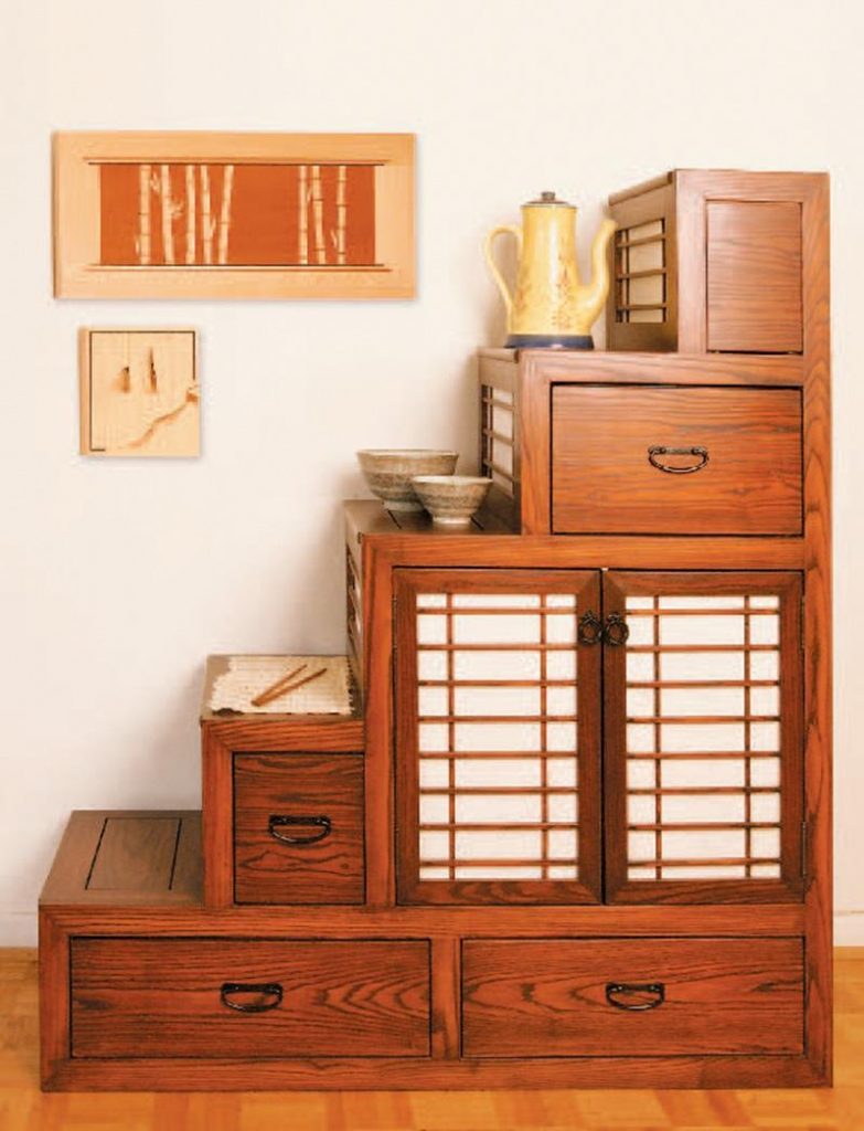
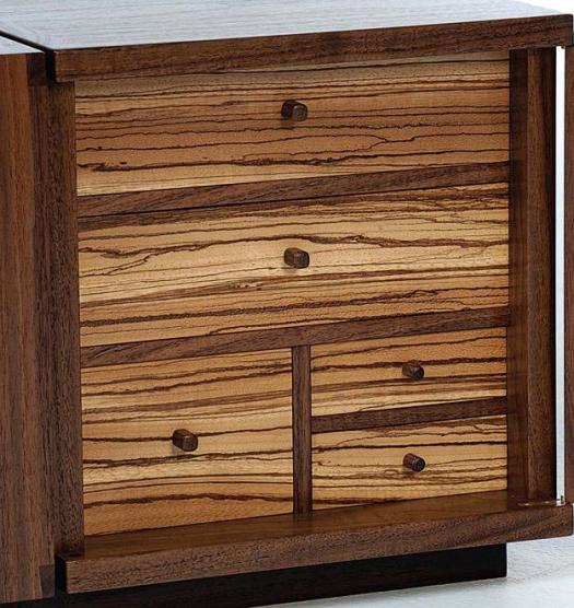
Walnut coffee table
Using a recently completed coffee table, I will show how decisions regarding grain graphics and wood choices influenced my design and how I incorporated them into the building process. For this piece, I chose black walnut. The black walnut’s unpredictable grain graphics provided a subtle distraction from the exposed dovetail joinery, and its warm tones kept the mood of the piece casual. Black walnut is readily available in board widths over 13″, accommodating the width of each box. I could have joined several smaller widths, but felt that would only distract from the simple design and clean lines of the piece. When the rough lumber arrived, I began to observe how the grain traversed the board by looking at all sides, including the ends, and located and marked all imperfections with chalk. Next, I outlined the walnut parts that I needed on the board, leaving extra material around the outer edge to compensate for possible wood movement and minor adjustments needed to straighten the grain or join boards. The important thing to remember when marking out each part is to do the best you can with what you have and expect some unforeseen changes.
Change is good
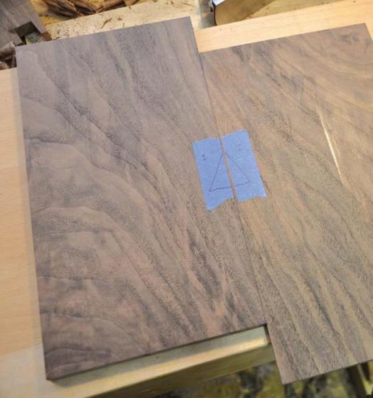
There are several cases where my original idea for the grain graphics changed or was not possible after milling and during the building stages. Sometimes the grain would suddenly flow in a different direction or I might come across a large undesirable section of sapwood or maybe a knot. In these instances, you really have to appreciate the material you are working with and find beauty in the imperfections. This helps to keep things moving forward and the process of working with graphics enjoyable. My plan was to use a cathedral grain pattern on the two doors but was unable to find such a pattern in the remaining black walnut. I nevertheless worked with the remaining walnut, carefully slip-matching boards with the same colour and grain angle, to create a door that would seamlessly blend into the box sides. In the end, I think it was a more suitable idea than my original, and the challenge made the project more enjoyable. When joining the boards for the doors, I brought both halves as close as possible to final dimensions, where only a few passes of the hand plane and a light sanding was necessary. This is a more critical step when you are trying to preserve a prized grain pattern. I hid the joint by placing it in the neutral colour area of the board between two-grain lines. The resulting joint is slightly angled, rendering it more difficult to find. Next, I did a dry run, lining up the grain as best I could, and marked the center joint with a cabinetmaker’s triangle, which I used as a reference for my glue-up.
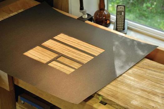
I chose zebrano for the drawer fronts because it added a little tension to the overall piece and a pleasant surprise when you opened the doors. I also liked how the zebrano’s broad grain, colour, and unpredictable movement complemented the black walnut. The board of zebrano was wide and long enough to accommodate all five of the drawer fronts, allowing me to keep the grain flowing continuously from one drawer to the next. With the help of a negative template (a large piece of paper with the exact dimensions of the drawer fronts cut out), I was able to find the most attractive grain patterns. I simply slid the template over the zebrano until I found the graphics I thought would look good on the finished drawer fronts.
Re-sawing can create harmony
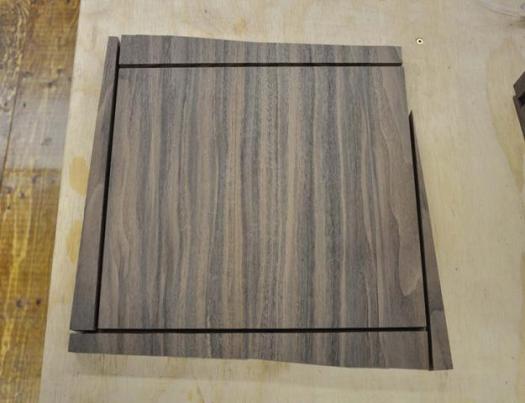
My favourite, and possibly most addictive, way to use grain graphics on a piece is to create discoveries. Some are obvious, taking no time to find, but others may take a lifetime to notice. In this piece, the drawer bottoms were cut in succession, one above the other, from a board of 2″ brown mahogany. The front of each drawer bottom is spalted with contrasting dark lines that complement the drawer fronts, making it appear as though the drawer fronts are melting into the drawer bottoms. To strengthen the profile of the coffee table, I wrapped the wood grain around each individual box like a ribbon. To achieve this, I simply split a 2″ board in half so that when opened you are left with a book match. Bringing the two opposite ends together, you are left with a long board of continuous grain. At this point, you can consecutively mark each side of the box, starting at one end and working toward the other so the grain flows seamlessly around the box.
Grain is not only aesthetically important, but when used correctly, it can provide stability to your piece. I chose wenge for the base of my coffee table because I liked its dark, grounding tones, and the density of the wood gave me a strong platform for the boxes to sit on. Because the boxes would be positioned only with dowels on top of the base, I needed to use a wood that would have minimal movement. Rift-sawing the wenge provided a visually calming appearance with its straight grain on all four visible sides, but it also provided me with the stability I needed for the structure of the piece. Rift-sawn and quarter-sawn lumber provide calm graphics and stable stock perfect for such parts as doors and drawer sides and bottoms.
I hope this is only the beginning and I encourage you to experiment and discover the ways grain moves through a board and how the grain pattern is modified when certain cuts, either straight or curved, are made in that board. This will change the way you look at grain and give you the confidence to find and draw out the grain graphics you are looking for when creating a piece. The beauty of being attentive to the wood’s graphics is that although well-crafted furniture doesn’t rely on the grain, the graphics are often what make your piece sing.
Photos credit: Jason Klager; Lead photo by Jayson Hencheroff
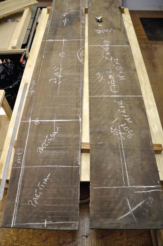
Planning is Crucial
Klager marks the rough boards he’s going to use with chalk. Starting first with highlighting the knots and other imperfections, he then adds layout lines for the different parts to be cut from the board.
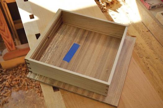
Small Shift
If you cut your parts oversized you have some flexibility when it comes to joining the parts together to form larger panels. In this case a shift in the position of each board brings the grain lines in alignment, almost concealing the joint and making for a nice match.
Negative Template
In order to clearly see what the grain of a board will look like cut into smaller pieces you can use a negative template (top). It will focus on only the areas that will be included in the final parts (bottom). (Photo by Jayson Hencheroff)
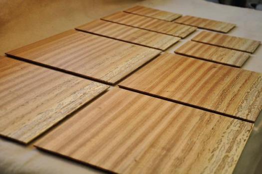
Oversized Panels
Working with panels that are oversized allows you to adjust the trim cuts appropriately.
Uniform Bottoms
These drawer bottoms were cut in succession, and all match very closely. They add a nice surprise when the user opens the drawers.
Looking Through a Window
Klager positions the actual drawer over the bottom to mark it accurately, keeping the grain parallel with the drawer parts.
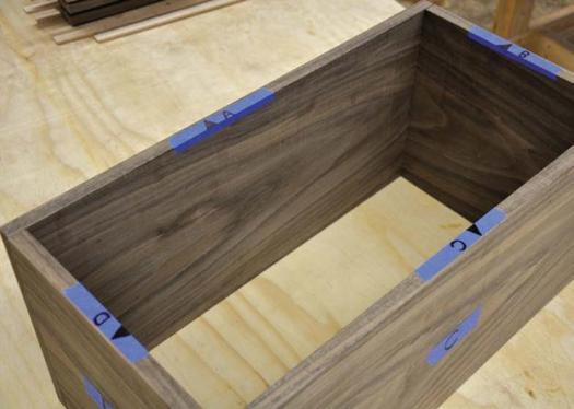
Continuous Grain
By re-sawing a 2" thick board, and keeping all the ends of the mating cuts together, the grain will run continuously around the box when assembled.