TIPS & HOW TO
Seven fundamentals of good design
Meredith Nicole
Design principles, their definitions and how they relate to furniture design.
My woodworking mentor, Robert Van Norman, studied under the esteemed woodworker James Krenov. Robert remembers many of JK’s wise words, especially “trust your eye”. When it was time for me to hear those words, I remember feeling such relief and permission to embrace my inherent perspicacity. Intuition is essential in the design and creation process, and for developing work that reflects the maker beyond his or her technical skill alone. At times, the craftsperson is called on to explain the aesthetics of his design and saying “it just feels right” doesn’t always cut it. This article covers seven common design considerations, their definition and how they are generally accepted and understood. Not only will the article help increase design vocabulary and awareness, but it may also assist in problem solving and recognizing the aesthetic strengths and weaknesses of a furniture piece.
The best way to use this article is to visually break the furniture piece down with reference to the categories listed. On a piece of paper, write down the main focus or core of the piece and place it beside the project. With a critical eye, question whether all the elements support the main goal. Ask why you have designed it this way. For example, if the main focus is to have a comfortable chair, you might want to consider which lines, texture or colours visually inspire people to think the chair is comfortable and stable even before they sit in it.
Contrast
Contrast is created when you have two or more related elements that are different. Contrast can be used to add visual interest, depth and to highlight a dominant element. It is also a way to unite a piece and often bestows energy to a design. If there are too many contrasts or the differences are too severe, there is risk they will not only compete for attention, but may also create unbalance, confuse the viewer and create optical illusions. To achieve success with contrast, ensure the differences are obvious enough, but without an overpowering presence. Each design element mentioned in this article can be manipulated to create contrast. Each of the images not only relate to the corresponding element but also exhibit contrast.
Proportion
Proportion is the correlative relationship of all the parts to the whole. Although proportion usually refers to size, it is also a way to compare harmony between colour, quantity, placement and degree. Proportion is achieved when all sizes, shapes, textures, colors and so on complement one another. Remember that the eye appreciates some differences and may find equal parts monotonous and boring. Dividing space into equal parts such as halves, quarters and thirds is predictable and as a result the eye often skips past it.
Our understanding of what makes pleasing proportion is deeply imprinted in our mind and of all the design elements is the least influenced by one’s cultural experience. Desirable proportion has long been based around ratios we see in nature with an emphasis on the human body. The “golden rectangle,” considered to be divine proportion, has been used since at least the Renaissance period in art and design and has largely influenced our common experience with architecture and design. In fact, we often don’t even see proportion until something is out of proportion.
Shape or Form
Shape or form is determined by outline and defines an object or space. Two-dimensional form has height and width, whereas three-dimensional form has height, width and depth. There are three basic types of shapes: geometric, organic and abstract.
Geometric shapes are made from straight or curved lines such as circles, squares and triangles. Their easy-to-recognize and often symmetrical patterns offer a sense of order, efficiency, strength, formality, but to some may be seen as uninteresting. Squares and rectangles are the predominant geometric shapes seen around us, not only in furniture, but in all areas of life. A circle has no beginning or ending, making it complete and inspiring thoughts of nature, perfection, unity, initiation and inclusion.
A great example that highlights our emotional connection to the rectangle and circle is to look at how these shapes have influenced table design. Rectangle tables have often been used in boardrooms and for formal dinners with, traditionally, the most important person being seated at the head of the table, which can perhaps create an instant hierarchy. A solution to this perceived inequality may have been found in the design of the round table, much favoured by King Arthur who considered his knights as equals.
Organic shapes are typically irregular or asymmetrical and are representative of shapes found in nature such as leaves, puddles and flowers.
Abstract shapes are considered in two ways. Shapes that are difficult to identify and sit outside our daily visual experience are called abstractions. The others are highly stylized organic shapes that are recognizable and usually provide specific information. Letters of the alphabet and the male/female symbols for washrooms are examples of abstract images.
Line
Line is defined by two points and is long relative to its width; it can be thick, thin, vertical, diagonal, straight or curved. Lines are often used to define a space, draw attention to a particular area and guide the viewer’s eyes around a piece. To critically examine line in your design, look at the relationship between the lines, including ones which may be created in the negative space. How do they align? Do they lead your eye around the piece or do they stop abruptly and create disorientation?
Horizontal lines communicate a feeling of length or width and continuation. Being parallel to the earth they suggest stability, calm and rest.
Vertical Lines provoke a sense of height, evoking feelings of power and courage but at the same time instability.
When vertical and horizontal lines are used together, they create balance and connect us to the structurally reassuring square and rectangle.
Curved lines inspire happiness and create a feeling of movement.
Texture
Texture is the surface quality of a material. Texture has great potential to connect the observer emotionally to the work, inviting the person to touch and explore it. On a chair, for example, the texture of fabric can tempt persons to sit in it or immediately reject it. Smooth surfaces reflect light and can appear shiny making a piece feel light. Heavily textured surfaces absorb light. When considering texture, look at it from all angles and under different light conditions to see the full impact of its surface. To help determine scale with texture, the guidelines under pattern and proportion can also be followed.
Pattern
Pattern is the ordered repetition of an individual element. Pattern needs repetition in order to be considered a pattern. However, as already mentioned elsewhere, repetition can become boring. Slight variations in a pattern break monotony and add life to it. This also makes a pattern more familiar, especially if it relates closely to patterns found in nature. If a pattern is being created using a decorative motif, consider the dimensions of the surface area on which the motif will be seen to determine the motif’s scale. Larger surfaces can support a larger motif and allow the viewer to fully appreciate the impact of the repetition. If the motif is too small, it can be distracting and make the area feel busy.
Colour
Colour has three main qualities: hue, value and intensity. They can also be described as warm (red and orange) or cool (blue and green).
Hue is the name of the colour: yellow, red, blue, etc. Value is how dark or light it is. Intensity is how bright or dull it is.
Dark colours appear heavier and create a feeling of stability, whereas light colours hold less visual weight and can appear unstable. When joining woods of dark and light colour, the visual effect of heavy and light suggest that darker woods work better when used on the bottom. A suggestion from my mentor to help getting proportions right was to spray paint mock-ups with a colour similar to the woods to be used later.
Photos credit: Ingeborg Suzanne; Lead Photo by David Welter
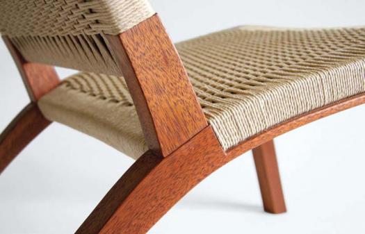
Contrast in a Chair
Smooth and rough, light and dark are the main contrasts in Michal Opalski’s chair.
Subtle, but Important
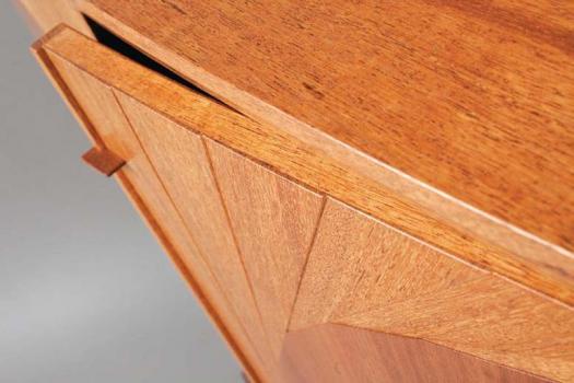
Craig Johnson of Studio Tupla uses subtle contrasts on his cabinet. Besides changing the wood direction slightly on the cabinet doors to create the V-shape, each section of wood also has a slightly raised edge, which creates soft shadow lines and subtle texture.
Playful Approach
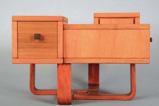
Juan Carlos Fernandez plays with proportion of the squares and rectangles created in the positive and negative space of this box.
Balanced Bed
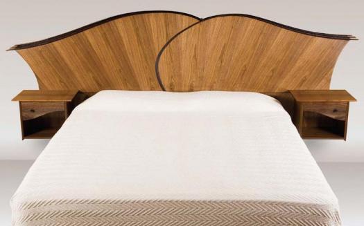
Karen McBride was careful when dividing up the headboard, the bed area and side-tables to avoid a calculated feel and still create visual proportion. (Photo by Christopher Solar)
Time for Geometric Shapes
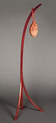
Neil Moledzki Tribute clock is a reproduction of a clock made by James Krenov. The sweeping curves and the impression we get of the clock weighing down the stand produces an organic and even animated feel to the piece. It should be noted that something that has an organic feel is not the same as having an organic shape. If we break the parts down on the clock, we can see it is made entirely of geometric shapes.
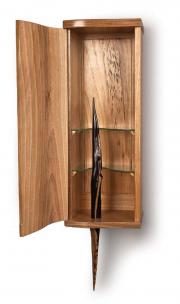
Sculptural Shape
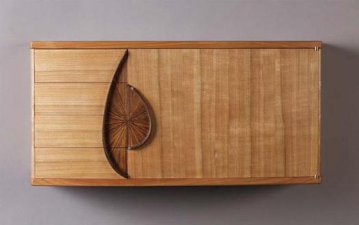
Meredith Nicole houses an organic shaped sculpture inside of a rectangle cabinet. The organic pattern on the back panel and the cathedrals on the door mirror the main focus, which is the sculpture.
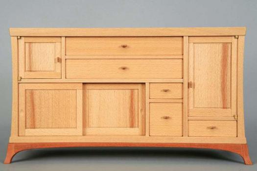
Straight Lines
This small jewellery box, built by Scott King, is a great example of how to successfully use line as the main focus.
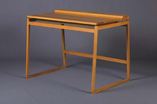
Crisp, Clean Design
Ian Godfrey successfully keeps the viewer focused on line by ensuring the proportions and details support clean and uninterrupted lines.
Eye-Catching
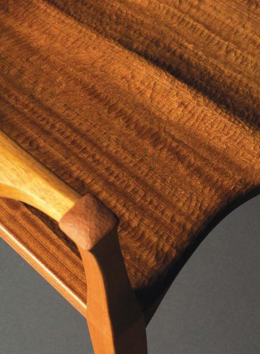
Junior Brake created beautiful texture on his chair using a chisel. He reminds the seat’s occupant of the texture on the seat by repeating it on the top of the arm-rest.
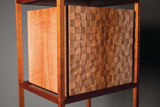
Checkered Texture
Hong Hyunsoo uses pattern and texture on this cabinet door. Each square was cut individually at a slight and non-calculated angle. This understated variation is key to creating a sense of movement and energy to the texture without screaming for attention.
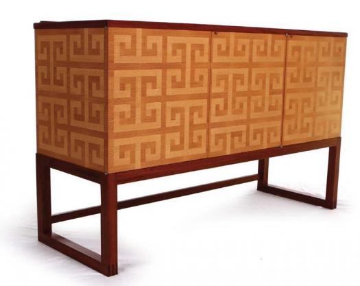
Obvious Repetition
There is no question that pattern is the main attraction on Laël Gordon’s sideboard. By using a motif size that complements the cabinet’s size, the full effect of the motif is appreciated without feeling busy. (Photo by Allen King)
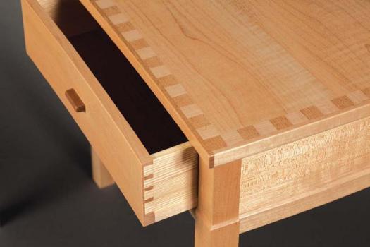
Simple Squares
Ian Crosby adds a subtle visual interest to an otherwise plain piece of maple by inlaying a pattern of squares (frieze). Crosby played with the prismatic of the wood and rotated the squares to create the illusion of using a light and dark wood.
Colour Variations
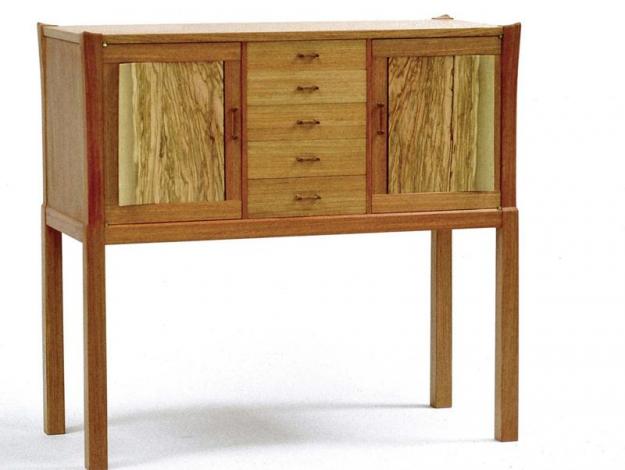
Jacques Breau frames in the parquetry and provides a visual cue for the user as to where the pulls are for the drawers and the cabinet door with the use of a dark wood.
Colour Integration
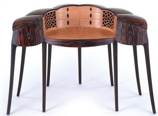
Brian Newell creates a dynamic relationship between light and dark. Often, when contrast is employed, the focus is about the difference, but here Newell’s focus is about integrating the light and dark. This is achieved by using dark wood (Macassar Ebony), which also contains the same hue as the light wood (Pear), and by creating dark areas on the light wood from the negative space of the pierced carving and the pulls. (Photo by Yoshiaki Kato)


amazing I learned so mcuh
Wow! Very well written article that helped me to great extent.