FROM ROB'S BENCH
Design: the overlooked detail

Rob Brown

Blog for October 30, 2025
Last week I talked about a few emails I had received about the previous week's column. So, to confuse things, this week I'll talk about an email I got about last week's column.
I just want to make sure everyone is paying attention here!
Last week I went over many of the construction details for an arc coffee table I built many moons ago. I wrote, “After going over a few designs, we settled on this approach.” I skipped over that whole process, as last week’s column was about how I made the table. Christopher Jackson, an avid reader, emailed me to ask how I came up with the design.
The design is the hardest part
I replied to Christopher, but thought this would make an interesting topic to write about this week. In my mind, the design of a piece of furniture is the hardest part. When I start designing a piece, there might be lots of parameters set out by the client, or there could be virtually none. It’s always easier for me if I’m given at least a few starting points, just so I can be sure to design something the client will like. Obviously, I have the basic type of piece settled (coffee table, dresser, dining table, etc.), but the client may have other basic details in mind, such as wood species, rough overall dimensions, functional details and general style may, which further helps to refine the design process.
Every client is different
It will come as no surprise that every one of my clients is different. Some have strong thoughts on the design of a piece and already have an assortment of images and sketches to share with me. Others just have vague words like “modern”, “clean” or “antique” in their heads, so there’s a lot more I have to drag out of them. This also gives me a chance to put my own spin on the design. Either way, it’s up to me to put what they give me together and package it into a piece of furniture.
Arc coffee table design
Keep in mind, this project was about 15 years ago, so the details are a bit vague. With this specific coffee table I was tasked with designing, I seem to remember the clients wanting something minimal, yet quite powerful. They had seen some of my work at a design show, and were drawn to the use of bold, figured veneer in my work. I love veneer of any kind, so this project was off to a good start. After a few back-and-forths with some very rough sketches, they decided they didn’t want a rectilinear base. Their home was an older midtown Toronto residence that was quite rectilinear in its shape, and they were trying to bring a different shape and style to the house by adding furniture and décor that was less traditional.
It was at this time that I sketched out a table with an arced base, though the arc was the opposite orientation than the final table. It’s hard to describe with words, but the first arc I came up with was curved upwards, rather than downwards. If you’re still not with me, it was shaped like a smile, rather than a frown, when viewed from the side. I loved the look, as the overall design was very light and modern, but the design came with a functional deficiency, in that it would rock and tip over within seconds of being placed on a floor, sort of like a teeter-totter. I played around with some smaller brackets that would be placed on the bottom of the table, but these brackets started to ruin the overall design. I also played around with securing the “smile” base to a flat base, so the entire table wouldn’t fall over, but it started to become a bit busier than we all wanted it to be.
During this entire back-and-forth process, I ended up making a few to-scale models to show the clients. Sketches are a great starting point, but models can give a more 3D viewpoint, not surprisingly. I took many photos of the models and sent them to the clients. Some even involved inlay and perimeter grain matches on the top.
\
Back to the drawing board, literally
I kept playing around with the design, but I wasn’t getting anything I liked. I’ve mentioned in previous weekly columns that design can be very frustrating for the first 95% of a project and this one was no different. I kept looking back at my “smile” base lovingly, but knew it just wasn’t meant to be. Then it hit me. What about flipping the smile upside down and turning it into a frown. I know pop culture says that’s a bad thing, but in this case I’d disagree. In this new design we would still be left with the arc, but the weak point (the centre of the arc) would be moved from the floor to the immediate underside of the table, where I could add some large wood cleats that would help stabilize the top-to-base joint, though thankfully they would be essentially invisible in that location.
A few sketches sent to the client told me they really liked the design, so I made another simple model to show them. It was at this point I thought it would be an overall cleaner and stronger look to do away with any inlay or match on the top and go with one species. Because of the simplicity of the overall design, we opted to go for a very strong figure for the top, and contrast it in both figure and colour in the base. Tamo ash is a stunning wood that my clients were easily talked into for the tabletop. The veneer for the base was also fairly easy to choose. Macassar ebony complements the tamo ash in every way, and the clients loved the look.
The edges?
Initially I figured I’d cover the edges of the curved base with Macassar ebony, but something didn’t sit quite right about that approach. It would be impossible to get the grain to curve, so it would look a bit weird. I could easily go the other way and run shorter pieces of veneer with its grain going from face-to-face, but I didn’t really like that look either. Both just screamed veneer. While I love veneer, I don’t typically want a piece to immediately look like it was made of veneer.
Then it hit me; rather than use the ebony for the edges of the base, I could use domestic white ash in this situation, as it’s essentially the same colour as the tamo ash used for the top. And if I did that, I could bend-laminate a strip to the same arc as the base, then rip a 1/4″ wide strip from that lamination, giving me an edge with the grain running parallel to the base’s path.
From here on out it was just details, as well as talking the clients into my idea, which thankfully was easy.
To design, or not to design. That is the question.
Making projects from magazine articles is a lot of fun. It also takes much of the design process out of it. If you like the project pictured on the first page of the article, bingo! Just follow the steps, enjoy yourself and love your final project. When you’re working for clients it’s a bit different, though. You’ve gotta make them happy, while also not losing your shirt. Did I ever tell you about the three clients I didn’t make happy? Well, we’re out of time here. That’s a story for another column.
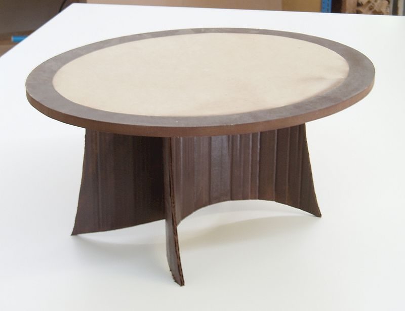
An Early Design
A model of one of the early designs included two curved legs. This design almost got the nod by the client.
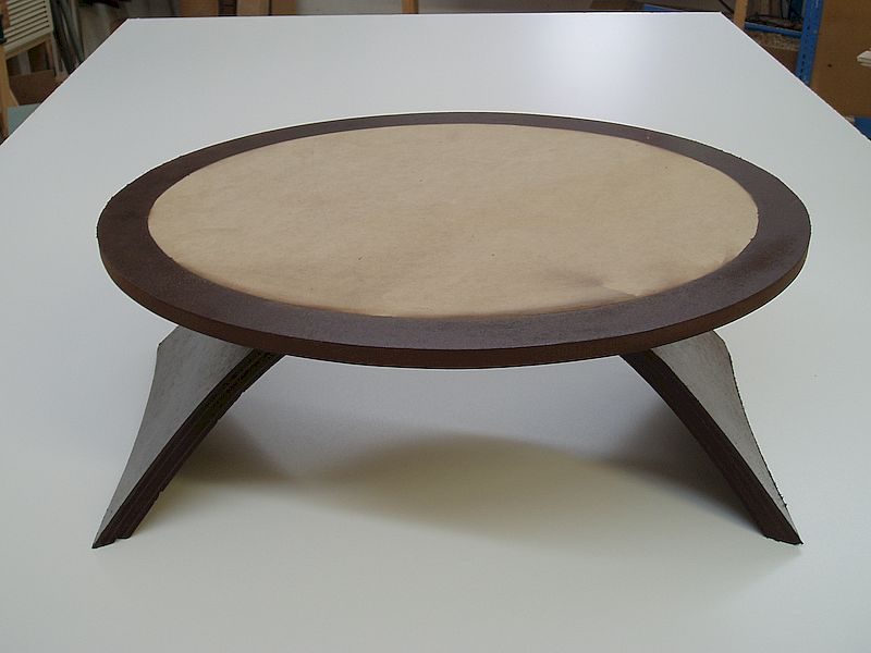
Not Quite
Another early design, this approach used essentially the same two curved leg sections as in the above design, but they were oriented differently.
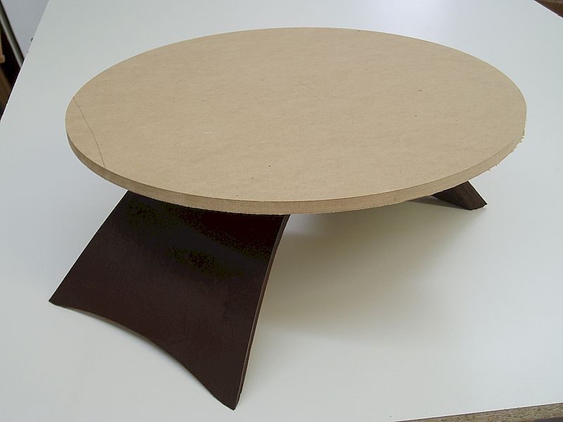
Almost There
Once I flipped the curved base over we liked what we saw. Notice the border around the edge of the top. The top would have had a figured center section and a darker perimeter.
The Final Model
This was the final model we decided on.


“Art is conceptually oriented;
Craft is object oriented.
Design delivers Art through Craft for Use.”
James Prestini
1 December 1991